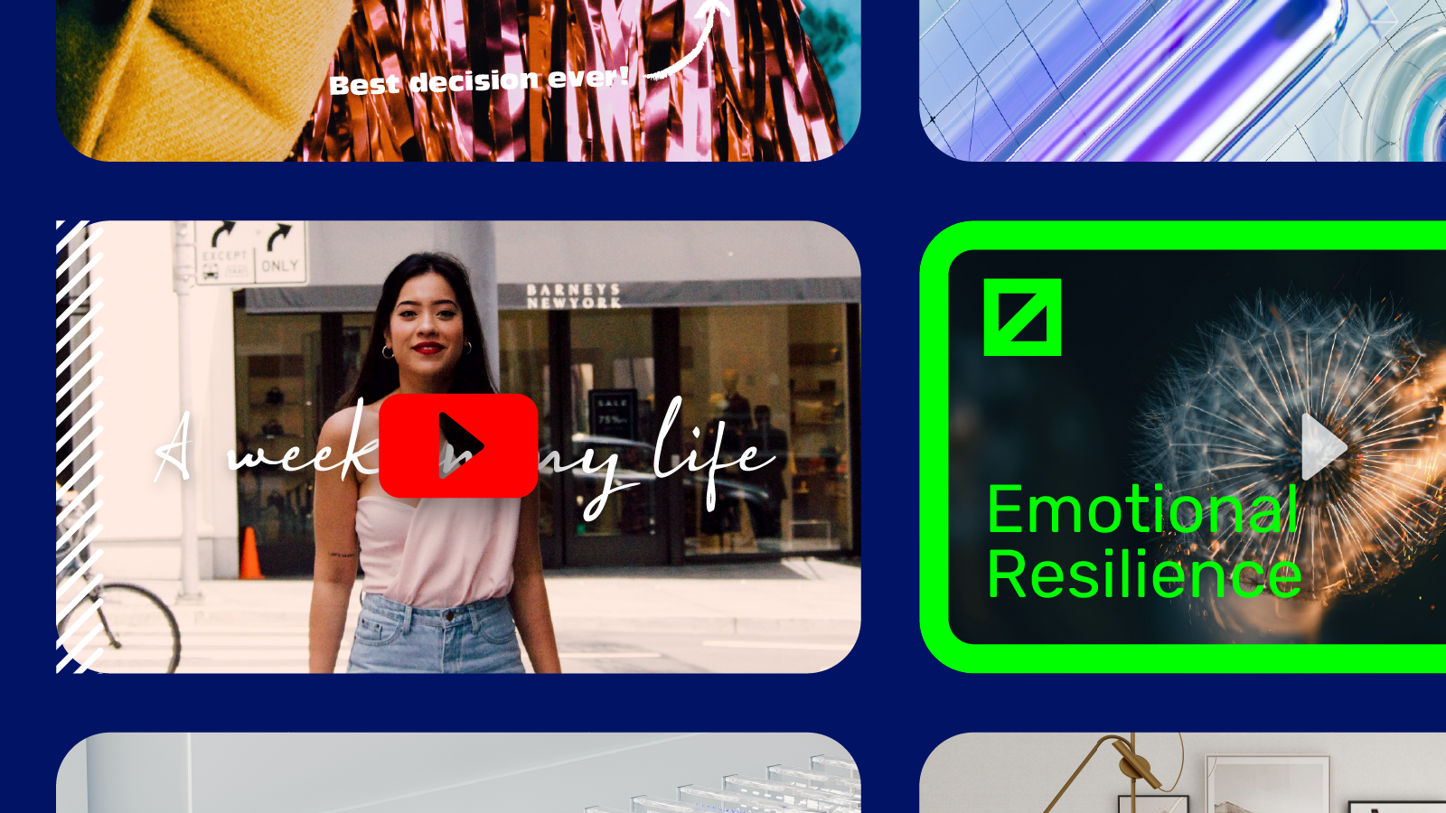
Your YouTube video thumbnail is the first thing your audience will see before they decide if they want to watch your video. The last thing you want is to put in a lot of effort into making quality content only for you to finish up with a thumbnail that does not entice your audience to click into your video.
Here are some best practices you ought to adopt to create attractive thumbnails your audience will want to click into.
How to Make an Catchy YouTube Thumbnail
Let us look at what makes “a catchy” thumbnail; the recommended size, what to include on the thumbnail, and how to make an outstanding thumbnail based on recommendations from top/highly ranked YouTubers.
Step 1: Competitor Research
Start by browsing through popular videos on YouTube. Look for channels that has content and audience groups similar to yours, and take note of what stands out for their thumbnails. It may be the colour scheme, use of illustrations, or even the use of descriptive texts. This helps you to identify the visible clues that may have triggered the viewer to click on that particular video.
An analysis by Best SEO company in 2020 picked out the following thumbnail characteristics from the most viewed Youtube videos
- Thumbnails with photos had an average of 1.7million views compared to those without photos/with illustrations at 1.4 million views
- 88% of thumbnails analysed were embedded with colourful schemes
- 72% of popular videos contained a real human face
- Thumbnails with logos/brand identity had 1.2 million more views than those without.
- 70% of most popular videos had a title/descriptive text within the thumbnails
Here are a few examples of videos with thumbnails designed as stated above.
Thumbnails with a human face
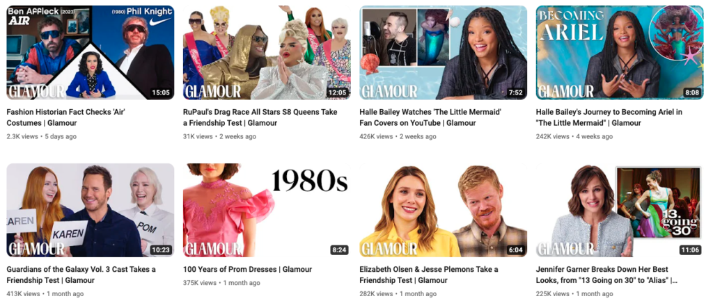
Glamour has done this very well by always featuring celebrities on their thumbnails. This helps to build trust and authority with the audience. By putting the faces of someone the public would know on your thumbnail, your audience is also more likely to be curious and click to watch.
Using bright colours
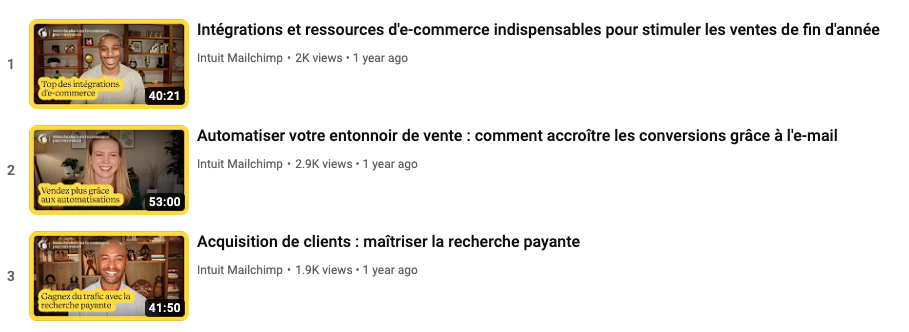
One way of creating an appealing thumbnail is by the use of bright inviting colours to attract the attention of your audience. Mailchimp has done this in a smart way by using their iconic bright yellow to outline their texts and frames in their tutorial videos. This helps their videos pop and makes their brand and YouTube channel easy to identify from a selection of many other videos.
Descriptive text/theme of the video.
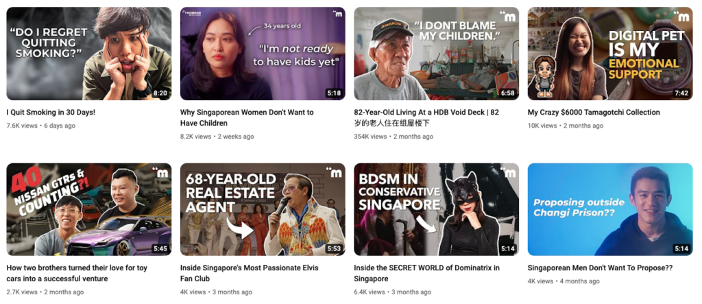
The use of descriptive texts prepares an audience on what to anticipate from the video. Take for instance the thumbnails below. In each, we already know what the video will be based on. The best way to display descriptive text on thumbnails is to use brightly popping colors that would be very difficult to miss even for a non-subscriber.
Use of Logos/Branding
There is a type of audience that is glued to particular brands irrespective of the content. For example, we have people who believe that Disney produces amazing content and would click without a doubt on anything uploaded by Disney. In return, Disney ensures that all their videos are branded with the company’s logo for ease of identification and marketing.
Use of Illustrations and diagrams on thumbnails
As a content creator in the education niche, illustrations/diagrams are a good accompaniment for your thumbnails. The use of illustrations gives viewers the idea that the video is all about explaining concepts or theories in a step-by-step manner.
Step 2. Choosing a Youtube Thumbnail Size
YouTube has a standard thumbnail size that you should follow regardless of the style or design you’re going for.
- Your image’s resolution is 1280×720 pixels with a minimum width of 640 pixels
- The aspect ratio is 16:9; which is the recommended YouTube aspect ratio
- The maximum file size is 2Mb
- Image in the format of JPG, GIF, or PNG
Best Practices for Customised Thumbnails (The Do’s and Don’ts)
- Go minimal on descriptive text. Do not overcrowd the thumbnail, instead use two-three precise words; summarising what your content is all about.
- Avoid cliche or exaggerated expressions. There is beauty in originality. Do not just throw in random words simply because they are trending. Also, avoid exaggerated expressions such as the “shocked face expression”,which may mislead your audience about the quality or intensity of the content.
- Keyword research/reverse engineer. Study your audience and identify the trending searches within your niche. This way, you will be able to create content based on what the audience is looking for and select outstanding keywords to be used on the thumbnail.
- Avoid jargon where necessary. When applying descriptive texts on your thumbnails, use simple terms that can easily be understood by an amateur. With this, anyone can click on the video without thinking of how technical it could be.
- Harmonize your content. The thumbnail, video title/description, and the video itself should be talking about the same concept. Do not use misleading thumbnails that have nothing to do with your video.
- No video titles on thumbnails. Do not use your actual video title as descriptive text on thumbnails.
- Practice makes perfect. There are a lot of suggestions on how to make a winning thumbnail. Should one of the above fail to work, keep experimenting with all the recommended guides till you find one that attracts more audience as you would have desired.
Best Youtube Thumbnail-Making Tools
Perhaps you are feeling worn out by the number of do’s and don’ts for an effective thumbnail. You don’t have any original images or you are not even sure which color combinations will work for your thumbnails. Here are the top 5 ranked platforms that can help you come up with a pro-level thumbnail for your videos.
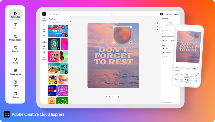
Adobe Creative Cloud Express
Adobe Creative Cloud Express has pre-designed thumbnail templates available for you to pick from. If you want to go extra with a more personalized concept, the website allows you to choose from over 18000+ fonts and templates with a variety of color schemes, texts, pics, etc, and a free 30-day trial period.
Canva
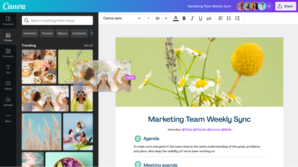
If you work in teams, Canva would just be the thumbnail designing tool for you. It has more than 1 million templates, photos, images, and fonts that are easy to use.
It is free to use but you will have to pay for some stock photos and clip art. Features like image resizing and background removing feature are also paid for.
Fotor
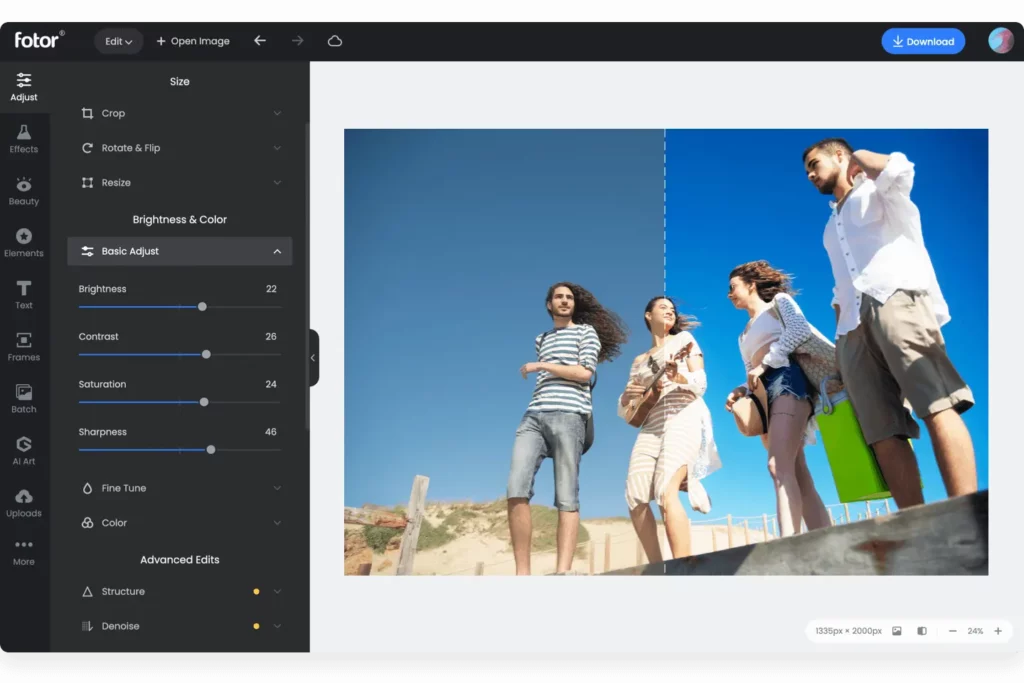
Fotor is the go-to website for unique emojis with an easy-to-use interface. It has beautiful thumbnail designs that can be customized to your liking.
In summary, utilising a personalised YouTube thumbnail can significantly enhance the number of views your video receives. It is important to adhere to the appropriate YouTube thumbnail dimensions and maintain consistency with your brand’s aesthetic when creating thumbnail images.
Additionally, it’s crucial to analyse the thumbnails of top-ranking videos within your topic to determine effective strategies. If you haven’t filmed your YouTube video yet, we’ve compiled a list of 20 ideas to provide you with inspiration for your next video.


