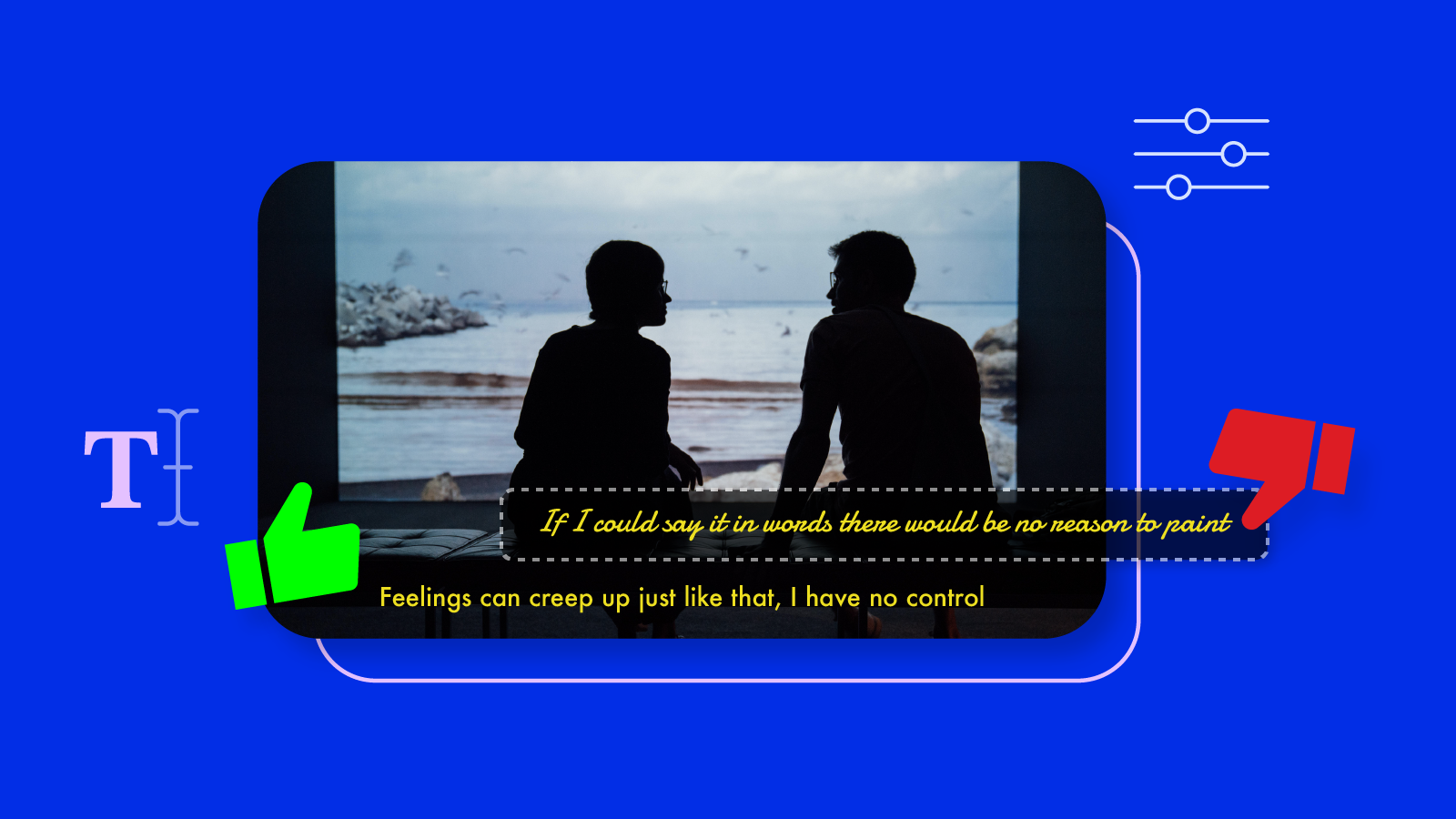
Adding subtitles to your videos are important but it may not be the easiest to identify the best and worst subtitle fonts. You want your subtitles to be readable, while blending seamlessly into your content so that you’re elevating your audiences’ viewing experience.
What makes a good subtitle font?
A good subtitle font needs to be clear and easy to read, while not drawing attention away from the video content.
Apart from colour choice, there are best practices and standard rules the industry follows. For example, subtitles are never bolded or underlined. Italics are only be used to indicate that the text spoken is not on screen. Also, it would be better to use sans-serif fonts for subtitles because they have more space between characters.
But how do you ensure your viewers are comfortable with keeping subtitles on? It all goes down to the right font selection. So here is a list of up to 10 types of font that works well for subtitles.
Ten Subtitle Fonts that Best Suit Videos
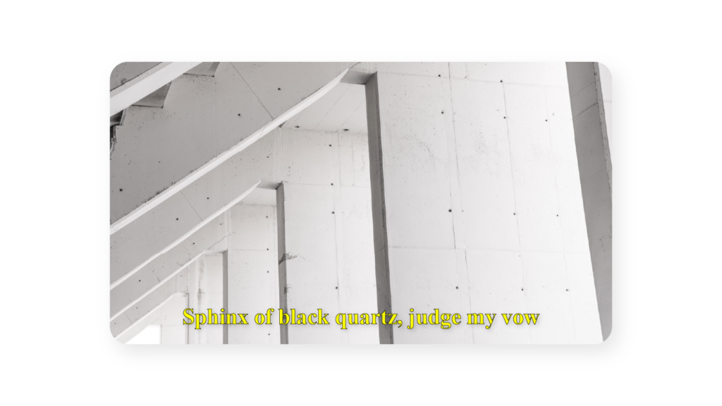
Times New Roman
This font is one of the oldest, most popular serif typeface fonts with a high familiarity amongst Microsoft office users. It depicts simplicity and can be a good choice for an editor looking for a minimalist design for subtitles.
It is free for personal use but will require you to get a license for commercial use.
Arial
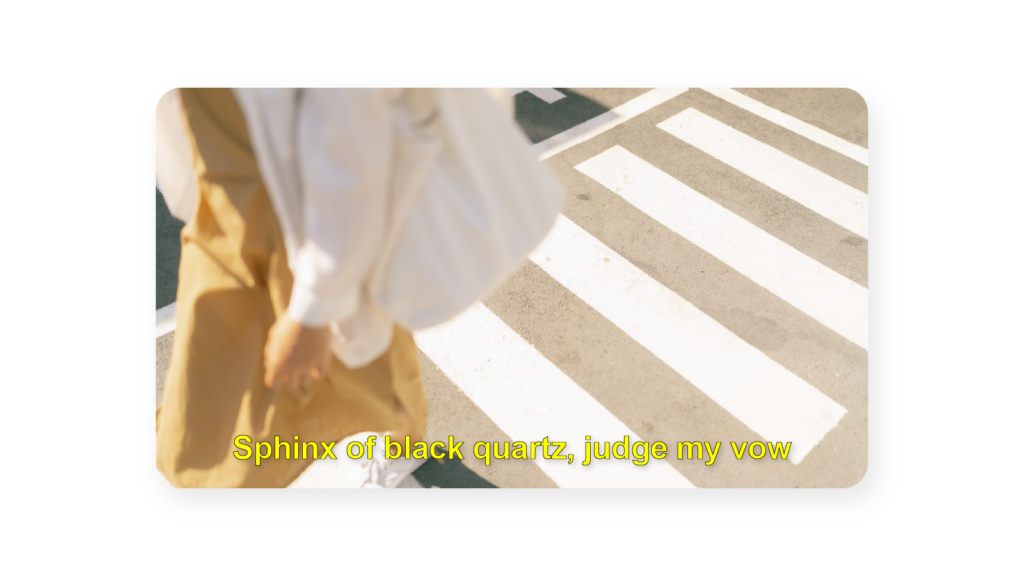
Also very popular; the Arial font is a sans-serif font that comes pre-installed in most gadgets. It also provides a simple look to viewers who do not want to be distracted by fancy fonts while watching the videos.
Like Times New Roman, it is free for personal use only.
Verdana
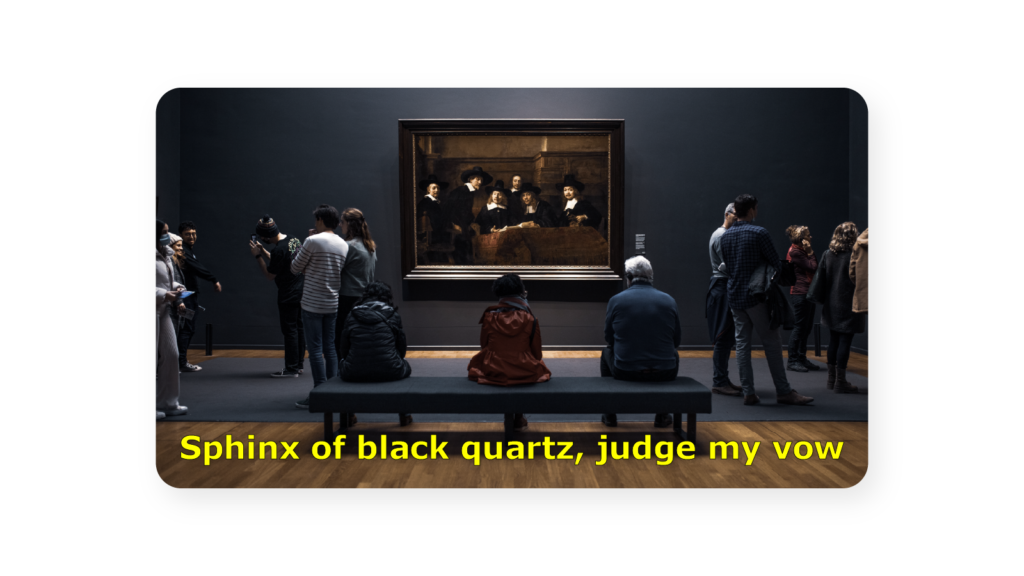
This is a humanist sans-serif typeface. It is readable at smaller font sizes and works best with lower video aspect ratios. Because of its ability to fit more text on the screen, it can be a good preference for anyone intending to add a higher number of captions at once on the screen.
Roboto
This is the standard font used on Google and YouTube video captions. Since it suits YouTube videos, it could as well suit other types of videos being uploaded on other social media platforms.
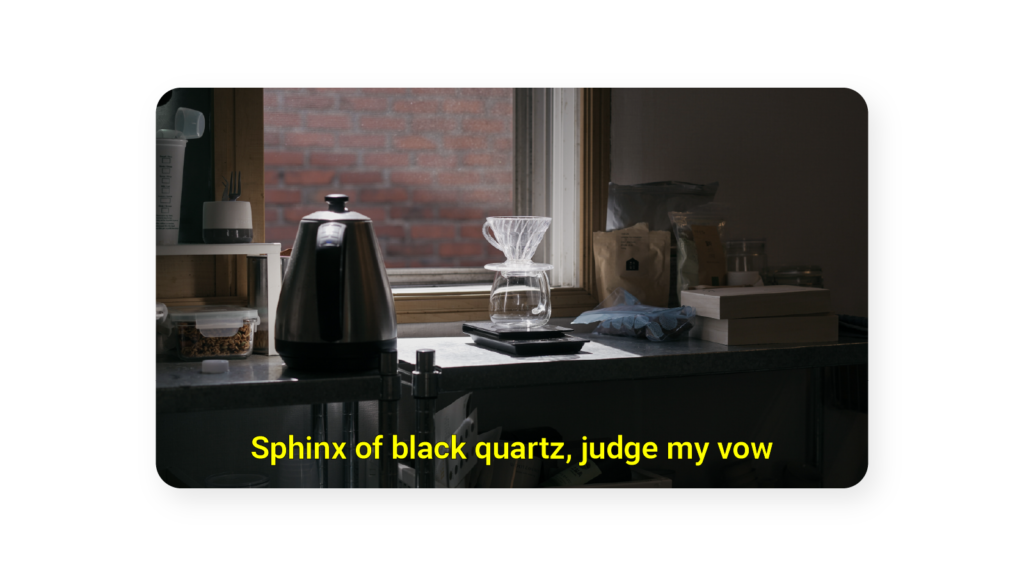
Futura
Futura is an easy-to-read sans serif font that is a great choice for movie subtitles and social media content. It is also quickly gaining ground as the choice subtitle font for video games. This font has up to 20 designs that you can play around with as a content creator till your desired caption output is achieved. It is also free for personal use but must be purchased for commercial use.
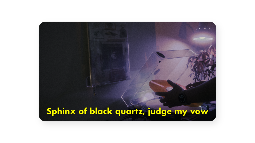
Calibri
This is a sans-serif font initially designed to replace Times New Roman as the default font in Microsoft Word, Excel, and Powerpoint.
It is also free for personal use and provides a simple minimalist look on videos.
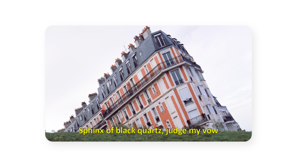
Tahoma
Best suited for creators looking for a narrow and sleek type of font. It is the default font in window programs and frequently applied by windows users
It is free for personal use but must be licensed for commercial use.
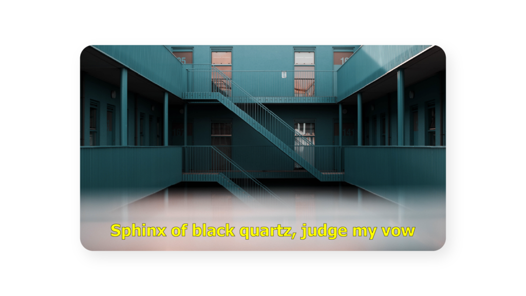
Helvetica Neue
One of the most used sans serif typefaces for designing, it is compatible with almost all universally spoken languages. That is English, French, etc.
This font is a safe font that has little to no impact on the video display. This makes it effective for designers or video editors who are not trying to experiment with conspicuous or distractive types of font.
Most yellow subtitles seen on commercial videos use Helvetica. It is free for personal use but will need a license for commercial purposes.
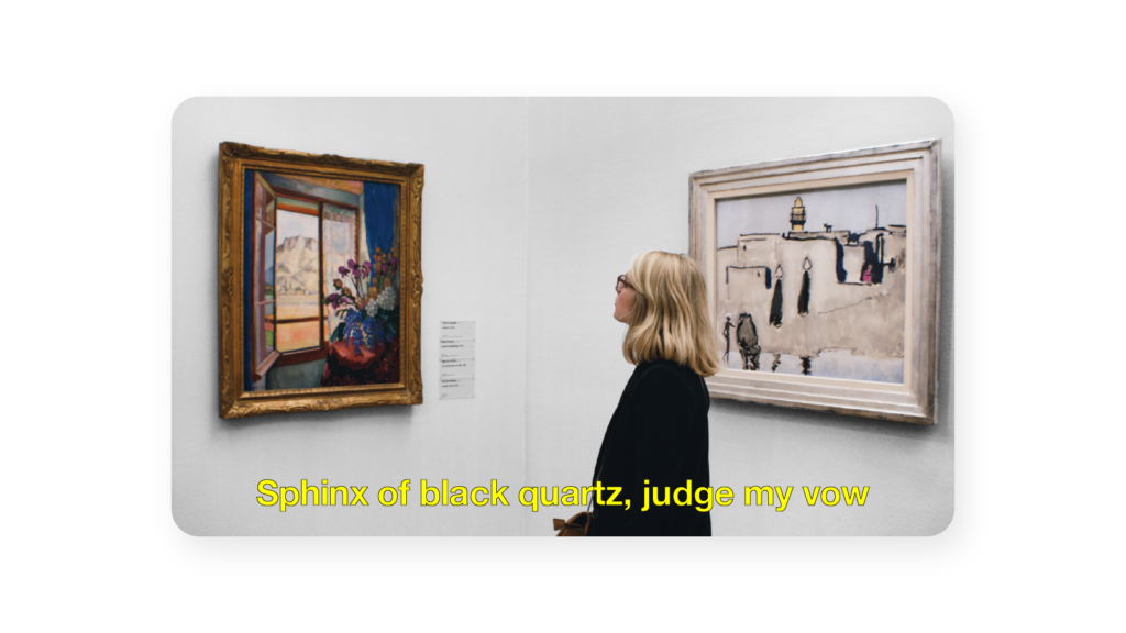
Lucida Grande
Is a humanist sans-serif typeface commonly used in mac Operating Systems and other Apple software. It has a large x-height that makes it an easy read.
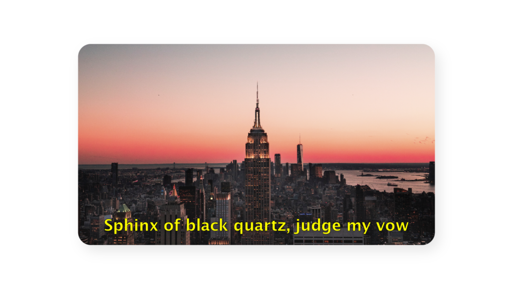
Antique Olive
Also a humanist sans-serif typeface; antique olive is best suited for videos displayed on large screens. It can be downloaded for free for personal use only.
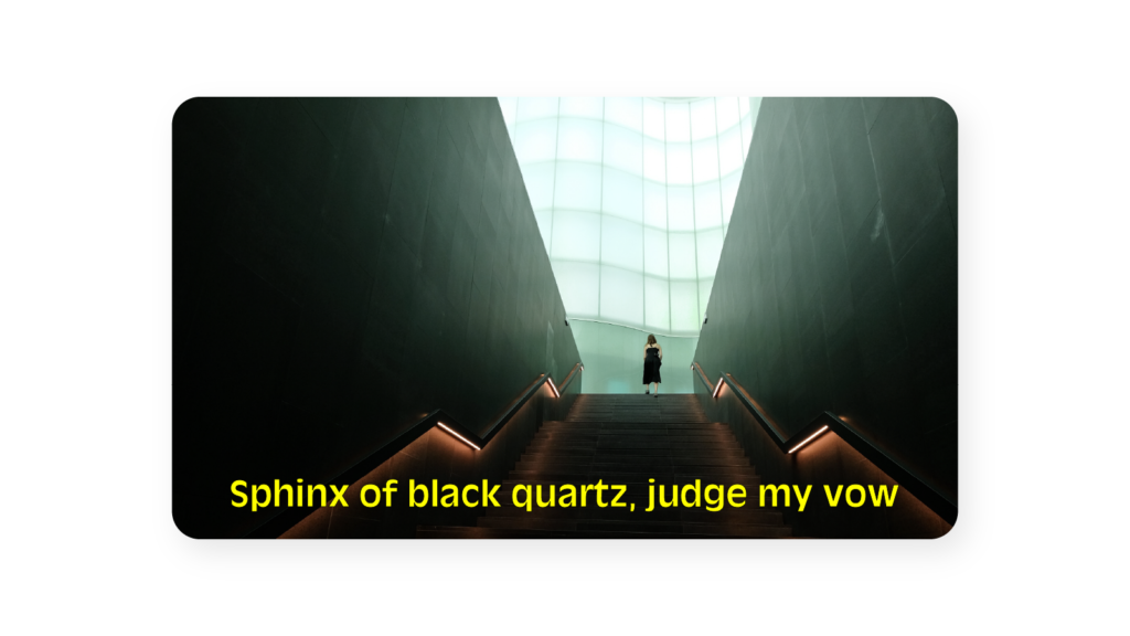
Worst Subtitle Fonts that Put Off Your Audience
Any calligraphy font that is used on documents to bring an aesthetic appearance should NOT be used for subtitles.
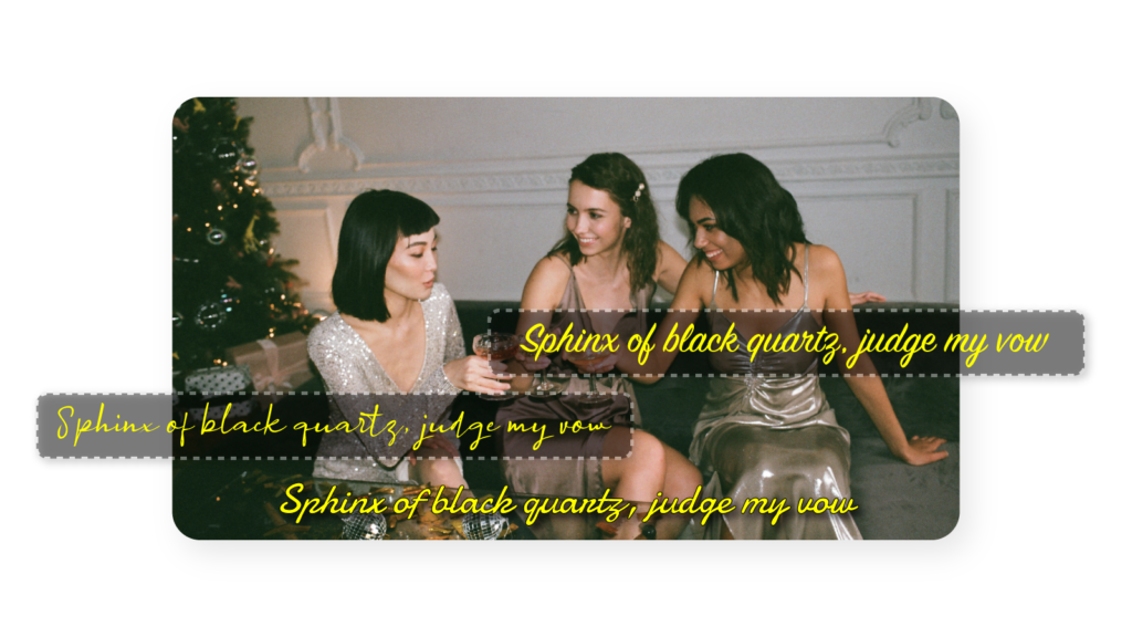
As per the standard rule in subtitling, italicized font should also not be used as much as possible.
The list of the worst font types is not exhaustive, but here are a few font types that should never be used in subtitles.
- Ananda Black
- Nature Beauty
- Algerian
- Bahnschrift condensed and the entire Bahnschrift family
- Bauhaus 93
- Blackadder ITC
- Harlow Solid Italic
Now you know which font best suits your videos; be it for Instagram, YouTube, or any other social media platform. At Auris AI, we also save you the hustle of choosing the best font types and colors by providing a FREE platform where you can have your videos transcripted and subtitles accurately added.


