Imagine a scenario where the font colors used for subtitles cause more eyestrain than encourage interaction with the video. Font colors such as luminous green, red, or luminous yellow will see your audience drop in numbers or make them turn off captions altogether.
One aspect of subtitling is readability. You not only want your content to reach a wider audience but also to make sure that they don’t get bored halfway. In a previous article, we discussed the importance of subtitles in videos. If you missed the first article, here is a brief overview of why you will need subtitles for your videos.
Uncomfortable/Noisy Environments
If a viewer is watching a video in the company of children who tend to be rowdy on a number of occasions; subtitles will really help to follow through the video.
Listening requires a higher percentage of concentration. At workplaces, people may prefer to watch videos with subtitles to enable them to multitask and respond to other co-workers without seeming absent-minded.
Reaching non-native audiences.
Sometimes captions/subtitles are translated into largely spoken languages like English and french to attract a bigger audience.
For instance, if the original audio of the video is in Chinese; using English/french subtitles makes it easier for viewers other than Chinese, to follow through.
Gaining an audience with viewers with hearing impairment
Quite a number of content creators are slowly expanding into the world of sign language. Some are embedding a minimized screen of sign language interpreters to cater to the audience with hearing problems.
However, a more effective way of reaching such an audience is to introduce subtitles to the video. The latter is less costly and everyone gets to follow through in a more convenient way.
Complementing unclear audio recording.
Have you ever watched videos in which you can hardly hear what the speakers are talking about? Including subtitles will help increase audience engagement with such kinds of videos.
How Do You Make Font Colors Pop? (The Dos and Donts)
As mentioned earlier, one of the best practices in subtitling is readability. We’ve shared the best fonts to choose when creating your subtitles. Colour is as important as font choice to make sure your subtitles are easy and comfortable to read, while making sure it does not interfere with the quality and visibility of the video.
These proven guides will show you how to achieve captivating subtitles while adhering to this first rule.
Choose font colors that are comfortable for the eye
Choosing the wrong font color or font thickness for your subtitles will definitely reduce engagement with your video just like not including them at all.
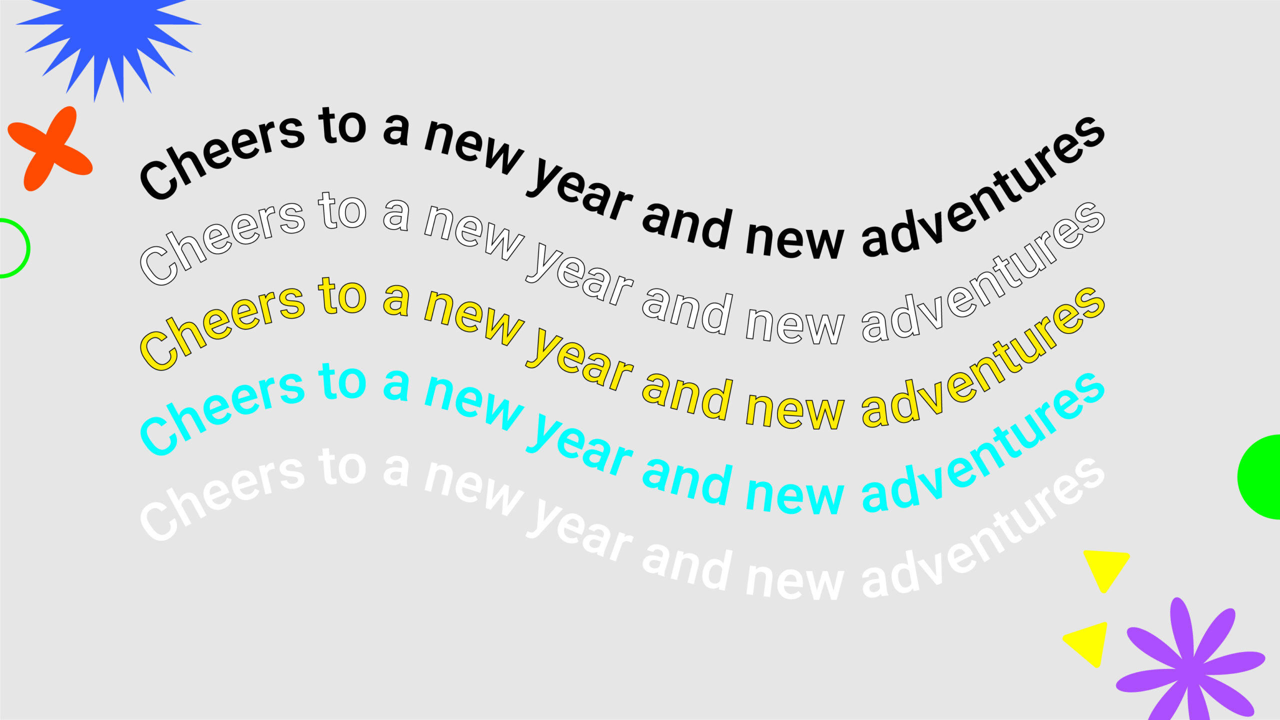
Black and white are considered the most readable font colors to use in subtitling. Furthermore, color combinations that involve black are more readable especially if black has been used to outline/stroke the text. A good example is white font color with a black outline/stroke or a dull yellow with a black outline (as commonly used).
Neon colors such as luminous green, luminous blue, etc can never be used in subtitling. They hurt the eye and the reader can barely focus on the text.

Use a Letterbox
Adding a translucent black letter box around your subtitles can make the text pop out hence increasing readability. A translucent letter box will not entirely prevent the viewer from seeing images at the back of the captions as compared to opaque letter boxes.

Increase the contrast of the video to the captions
Bright videos work well with black or white subtitles. If the videos are dull or seem faded, using any color other than luminous in high concentration will be effective.
Add strokes to the text outline
A thin black stroke around the words makes it more visible despite the contrast of the video. Depending on the font color; black and white strokes are the most preferred and can be used interchangeably.

Add a drop shadow to the caption texts
Drop shadows on the texts will also increase their visibility. Do not add shadows to the video itself to achieve the contrast because the main goal is to have a visually appealing video and interactive subtitles.

The Dont’s
These are some of the guidelines that have been recommended by other video editors, but they will actually do more harm than good to your video.
Adding a black stripe of opaque letter box to the subtitles
An opaque letter box may block part of the video which is not your intention as a content creator. Remember, both the text and the video must be visible and appealing to your audience.

Making the subtitle font color bold
This may work for dull colors and increases visibility on videos with a lighter background. It, however, may not be as effective as needed because standard captions rules are strongly against the use of bold, italics, and underlined subtitles.

Blurring the background behind subtitles
What is in the background of the subtitle? Your video/images. Blurring your images will definitely reduce the quality of the video.

Changing the subtitle’s location
The standard and recommended position for all subtitles is the bottom part of your video. Moving the text to the top, middle or any other position makes it awkwardly unimpressive. Regardless of how you intend to make the text more visible, never change the standard position.

Adding a translucent box all around the video
This is not recommended. It reduces the quality of your video and reduces interaction by close to 50%. Remember, subtitling is just a way to increase interaction with the video. So, adding subtitles should supplement and not compromise the value.

Which font colors are best suited for subtitles?
For marketing purposes, do not complicate your presentation. A simple black font will do for 99% of all videos. Let your audience worry about other aspects of the video but not quality or ease of understanding.
However, there is more to getting it right with subtitle formatting. That is why Auris AI has put together another informative guide on how to choose the best font for your subtitles. This platform will also give you the opportunity to automatically transcribe and caption your videos for FREE.